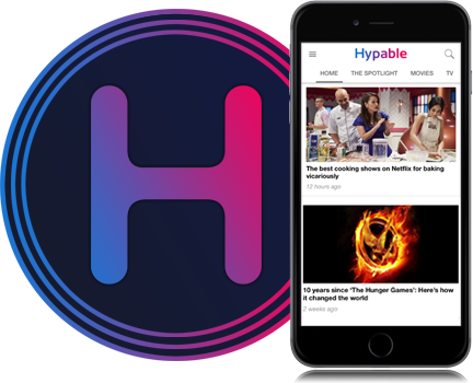
In a new instalment of his ego-crushingly unpopular column series, Richard gives some insight into Hypable’s new design, and attempts to address some of your questions and concerns while reminding you all that none of this is his fault!
When I first started this column last year, I promised you a lot of great things; thoughtful critical analyses, unrelenting pessimism, jarring but entertaining cynicism to name but a few. Unsurprisingly, I failed on all counts. Instead, I felt that easing you into a slow decline of disappointment would at least be advantageous in order to render you with the lowest possible expectations for when I do eventually try something new e.g. a Hypable redesign. With that said, I DID promise you some insight into the more technical side of the website in my first column… However, keeping with tradition, I’m not going to talk about that just now either. Because it’s boring. And no one cares. Especially you.
What I AM going to talk about is why we did decide to change Hypable’s design, why we opted for our new news layout and most importantly, why none of this is my fault.
Let us cast our minds back to March; the weather was fair, we were about to watch The Hunger Games, we were blissfully unaware about J.K. Rowling’s forthcoming novel, Hypable’s design was dependably static and Richard received very little hate mail (or at least, certainly a lot less than he deserved). Then something radical happened. Hypable’s design changed, Richard’s inbox exploded, he stopped speaking in third-person and, well, I think a quote from the Hitchhikers Guide to the Galaxy is rather apt here: “In the beginning the Universe was created. This has made a lot of people very angry and been widely regarded as a bad move.”
Modelling on our favourite (and most hated) political leaders, we decided to implement a change, give very little accountability and just left you all to get on with it. Now that the loathing hate has evolved into a dull roar, the time is ripe to give you some insight.
Let me start by telling you what was wrong with Hypable’s previous design in a futile attempt to convince you that change was a good idea.
It was boring
Now, I know what you’re going to say: boring doesn’t necessarily mean bad, don’t fix what isn’t broken, etc. Well, let me tell you something, boredom is very unfulfilling! When you’re a designer/developer (and in my case, I use the term lightly), sitting at home with nothing to do because your friends stopped liking you after that one time you went on MuggleCast and dissed Dan Radcliffe, repeatedly rocking back and forth as this haunting image of a popular but bland website waves at you, repeatedly mooning you with its smug blandness. It’s too much to handle!
I confess, like taking that first gulp of air after holding your breath for as long as possible, I surged ahead with a shocking lack of consideration for your feelings. I wanted a layout that wasn’t a mirror image of every other online entertainment news outlet. Something that wasn’t the traditional linear-sequential layout, monotonously listing each story one after the other with zero degrees of separation. Anyone with any artistic or technical inclinations (or even just those holding their breath for no apparent reason) will know what I mean when I tell you that no piece of work is ever finished; there is nothing that can’t be improved or re-imagined. So quite clearly, this area isn’t my fault.
It was easy to miss stories
Following on from before, the former design allowed you to instantly sweep your eyes through 14 stories per page with far too much ease. Here at Hypable, we like you to work for your news. We don’t do any of that namby-pamby intuitive user-interface stuff. Remember when I essentially told you throughout all my columns that I’m just a horrible human being? Well, this. I can’t be blamed for my lack of tolerance for all cultures, races, religions, sexes, species, colors, and feelings! So quite clearly, this area isn’t my fault.
More seriously, we post on average more than 40 times a day. It’s only natural that if you’re quickly skimming over stories that you may miss something that you would have otherwise wanted to read. By adding another dimension to your reading (previously from top to bottom, to left-to-right per row), the chances of you missing something are far reduced. Your eyes are now moving like a typewriter and while we acknowledge that this requires more effort on your part to consume the information you want, you are far less likely to miss something important as a result. We felt that was a sacrifice worth making, and remember that you CAN revert the news feed layout to the previous/classic format by using the My Feed option.
To try and make the feed a more engaging and enjoyable experience to read, we’ve added a wealth of new styles of posts from the big news format, to quotes, to the News By You, to the video, and more still. At least if each story has its own layout and identity, the feed itself is far more interesting to look at.
Less crap
Did you ever read our massive sidebar before? No? Me neither. After all, why would you? It’s not as if anyone ever puts anything worthwhile into a sidebar. Well, we mistakenly did. We filled it with our latest podcasts, our favourite stories and plenty of other stuff for you to ignore. And ignore it you did! The sad thing is, a lot of that content people actually wanted to see. As a result, we took it out of the sidebar and put it in the news feed along with everything else. Now that massively long sidebar that appeared on every single page has been replaced with a streamlined miniature spawn of its overweight, disgraced and lonely parent.
You see? I have your best interests at heart! I didn’t want your pages to be loading unnecessarily longer than they had to, so quite clearly, this isn’t my fault.
Therefore…
To conclude, none of this was my fault.
If you aren’t buying that, hopefully you will at least acknowledge that our change wasn’t a spiteful decision to make you all suffer but instead, an attempt to improve your browsing experience at Hypable. That’s not to say we haven’t listened to your feedback either; since launching, we’ve made frequent (and often daily) adjustments to the site based on emails, tweets and comments on how we can improve our design. Furthermore, we know there are still some bugs and kinks to be worked out and we’ll get to them. Every single one. And maybe then you will leave me to my isolated but tranquil existence.
We want to hear your thoughts on this topic!
Write a comment below or submit an article to Hypable.